This topic has been covered elsewhere but I thought I’d add my two cents, and it turned out to be slightly longer than Twitter could accommodate.
A lot of wacky things went on that day, as you’d expect when the weather and waxing are tricky and change dramatically during the race. I haven’t watched the TV coverage of the race myself, so I’m at a bit of a disadvantage here since I don’t have any sense of how things progressed and how the athletes looked except for what I’ve read online.
Basically, it started snowing shortly after the race started, which changed the conditions dramatically. This both made the conditions for later starters inherently more challenging and additionally some nations (e.g. Norway) just flat out missed the wax and had terrible, terrible skis.
So naturally we’re interested in whether we can see direct evidence of this start order effect in the results. My approach is actually quite simple (from the perspective of all the machinery I’ve built up over the years in the form of code written to push skiing data around). I’m just going to take the basic data in the graph I Tweeted earlier and rework it a bit.
The idea in that original graph is that I’m just taking each skier’s percent behind the median skier and showing a rough “confidence interval” for perspective (it’s actually just the 25th and 75th percentile of their races over the previous 1-2 years). It already suggests strongly that a lot of the people at the top of the results sheet had “surprisingly good” races, relative to their prior results, as shown by the gap between the red dot and the horizontal bar. We can just take the difference (scaled by the racer’s inherent level of variability, i.e. the width of their bar) and then plot the results relative to start order.
Voila:
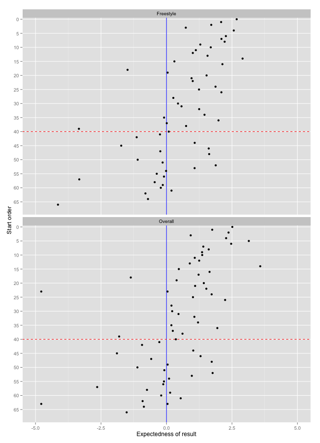
On the x axis, positive values are better than expected results, negative values are worse than expected. There were 4-5 athletes (no one notable) that I dropped entirely since they had so few results for meaningful numbers. The red dashed line is my rough guess-timate (again, based only on this graph; I didn’t watch the race) on where things changed. My placement is rather aggressively toward the back of the field; you could arguably say that between starters 25-40 things had stabilized somewhat, and then finally the conditions had really nosedived after that.
And of course as you would expect the relationship isn’t perfect. There are certainly folks at the back of the field that had good races, for them. But this seems like very strong evidence to me that it was simply a good day to be at the front of the field. Virtually all of those people had good to excellent races compared to their personal past performances.
The usual caveats apply here: this suggests there was an effect, but it can’t tease out the magnitude of the effect on a skier-by-skier basis. Different folks were impacted differently based on the specific wax they had, and how they responded in race to having a great (or terrible) day, in addition to the regular “noise” in athletic performances.
{ 1 } Comments