Biathlon’s cool in part because there’s so much more data to play with. One seemingly minor thing I’ve been struggling with is how best to graph an athlete’s overall race results and their shooting statistics on the same graph.
The obvious answer of just overlaying them and including a second y axis (since shooting accuracy and percent back are on very different scales) is a big no-no in the statistical graphics world. Dual y-axis graphs are very bad news, almost as bad as the hated pie graphs. In fact, they are so bad that the statistical graphing package I use literally can’t do them!
It took a little tinkering, but I think I like this solution just fine. Basically, I just put the two time series (percent back, shooting accuracy) in vertically grouped panels for each skier. The one drawback (so far) is that this means I can’t only extend this to multiple athletes by making the graph wider. It’s probably possible for me to “wrap” this around, but, well, you don’t care about the details. It’s complicated.
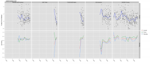
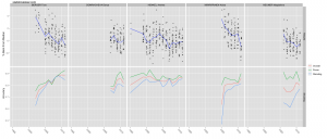
Anyway, as an example here are the graphs for the top five finishers from each of yesterday’s mass start World Cup races in Fort Kent. They’re big, so click on them for the full versions:
The top panels are actually percent back from the median skier (rather than from the winner) which I’ve learned to prefer. The blue line tracks the median result over time. Lower values are better. The bottom panels are shooting accuracy for each season, where higher values are obviously better.
One important piece of information that I decided not to squeeze on here is the number of shots, which early on for each skier can be very low. So, beware small sample size.


{ 3 } Comments