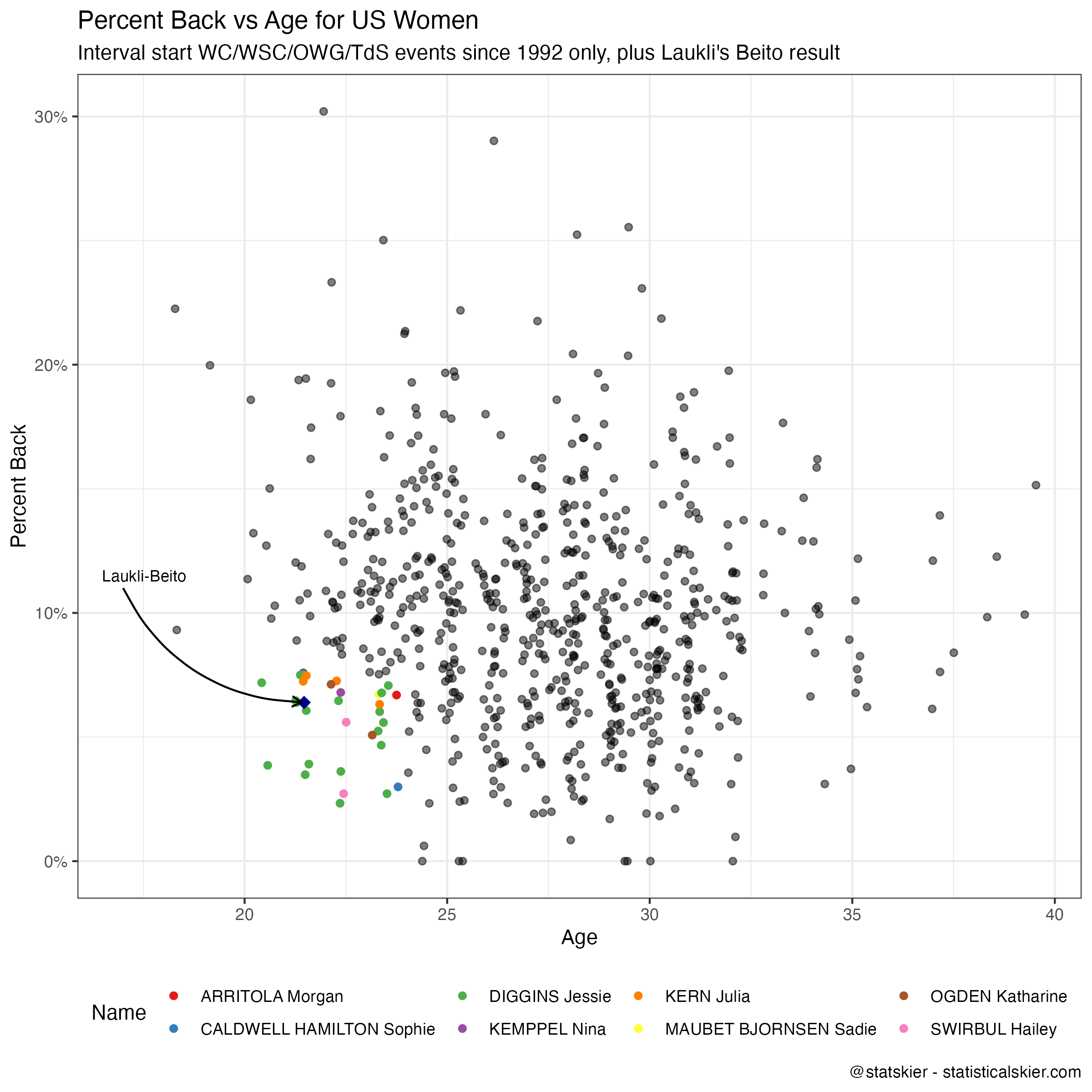
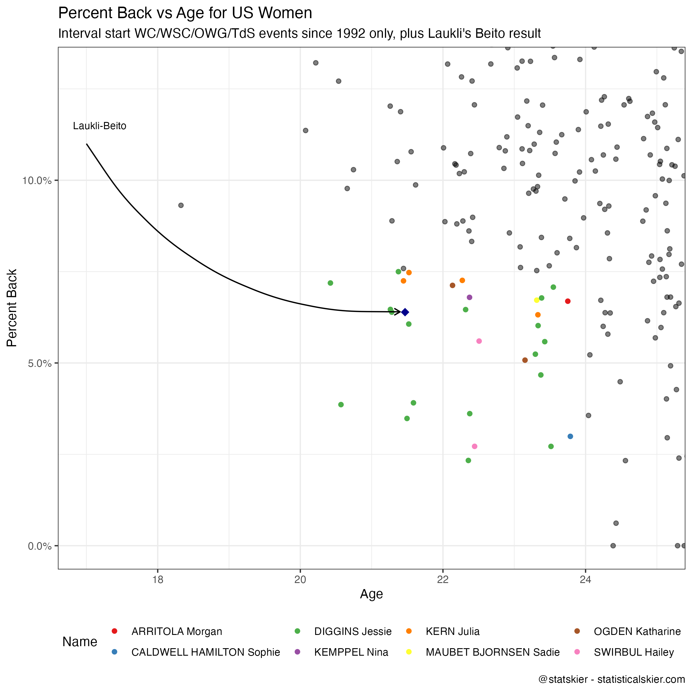
Ruka Classic Sprint Predictions
Don’t take this too seriously. This is mostly an intellectual exercise for me, based on an interesting method that was suggested to me several months ago. I’m not going to go into the details at the moment, I’m mainly recording the predictions here just to force myself to commit to following up on it afterwards. So I’ll try to update each prediction post with the actual results and a comparison. My expectations for it’s performance at the moment is fairly low.
The methodology is also still unfinished. I’m sure I’ll be fiddling with it a lot over the course of the season, but I’m trying to commit to publish these for as many World Cup events as I can. It’s sort of reliant on my having a reliable start list, so if I’m busy or traveling the day before a race, I may not get to it in time, we’ll see.
For the moment all I’m going to say is that I’m publishing predicted finishing order for the entire start list. The “Predicted PR” column is the actual value the model outputs, so it gives some relative sense of certainty. Values that are further apart represent more certainty of the gap in finishing place. But they are not probabilities and do not have any particular units.
Also, in case it wasn’t clear, I’m not terribly interested in participating in Twitter anymore, so anything I produce this season will be going here.
Men's Ruka Classic Sprint Predictions
| FIS Code | Name | compid | Predicted PR | Predicted Finish |
|---|---|---|---|---|
| 3422619 | VALNES Erik | 183,139 | 0.0321 | 1 |
| 3422819 | KLAEBO Johannes Hoesflot | 184,205 | 0.0267 | 2 |
| 3190345 | JOUVE Richard | 179,007 | 0.0245 | 3 |
| 3190323 | CHANAVAT Lucas | 168,688 | 0.0221 | 4 |
| 3290326 | PELLEGRINO Federico | 144,918 | 0.0211 | 5 |
| 3422477 | NORTHUG Even | 177,378 | 0.0195 | 6 |
| 3420909 | GOLBERG Paal | 137,887 | 0.0191 | 7 |
| 3421754 | TAUGBOEL Haavard Solaas | 157,019 | 0.0174 | 8 |
| 3424269 | EVENSEN Ansgar | 215,188 | 0.0110 | 9 |
| 3190282 | JAY Renaud | 150,125 | 0.0107 | 10 |
| 3501340 | GRATE Marcus | 181,962 | 0.0102 | 11 |
| 3501010 | HAEGGSTROEM Johan | 150,450 | 0.0100 | 12 |
| 3500664 | HALFVARSSON Calle | 120,914 | 0.0098 | 13 |
| 3180865 | VUORINEN Lauri | 176,533 | 0.0094 | 14 |
| 3190548 | CHAPPAZ Jules | 208,560 | 0.0086 | 15 |
| 3501976 | ANGER Edvin | 233,196 | 0.0083 | 16 |
| 3150570 | NOVAK Michal | 180,263 | 0.0083 | 17 |
| 3180861 | MAKI Joni | 176,068 | 0.0077 | 18 |
| 3423264 | AMUNDSEN Harald Oestberg | 197,939 | 0.0074 | 19 |
| 3530902 | OGDEN Ben | 209,211 | 0.0069 | 20 |
| 3510656 | GROND Valerio | 215,184 | 0.0062 | 21 |
| 3220016 | YOUNG Andrew | 139,062 | 0.0061 | 22 |
| 3424685 | JENSSEN Matz William | 224,936 | 0.0058 | 23 |
| 3510588 | RIEBLI Janik | 193,977 | 0.0050 | 24 |
| 3530910 | SCHOONMAKER James Clinton | 213,610 | 0.0050 | 25 |
| 3181408 | MOILANEN Niilo | 222,751 | 0.0049 | 26 |
| 3150664 | CERNY Ondrej | 206,915 | 0.0049 | 27 |
| 3430103 | STAREGA Maciej | 122,011 | 0.0043 | 28 |
| 3180508 | HAKOLA Ristomatti | 142,125 | 0.0039 | 29 |
| 3560101 | SIMENC Miha | 162,714 | 0.0039 | 30 |
| 3150549 | SELLER Ludek | 176,077 | 0.0038 | 31 |
| 3530713 | BOLGER Kevin | 180,596 | 0.0037 | 32 |
| 3180838 | AHONEN Ville | 169,918 | 0.0034 | 33 |
| 3501871 | DANIELSSON Emil | 223,006 | 0.0033 | 34 |
| 3100412 | RITCHIE Graham | 209,077 | 0.0032 | 35 |
| 3290379 | De FABIANI Francesco | 156,937 | 0.0032 | 36 |
| 3120068 | WANG Qiang | 170,343 | 0.0030 | 37 |
| 3181133 | MANNILA Lauri | 193,507 | 0.0029 | 38 |
| 3510417 | KAESER Erwan | 144,079 | 0.0028 | 39 |
| 3050267 | MOSER Benjamin | 180,664 | 0.0027 | 40 |
| 3190528 | SCHELY Theo | 207,366 | 0.0026 | 41 |
| 3180990 | HAARALA Juuso | 184,546 | 0.0025 | 42 |
| 3100406 | CYR Antoine | 208,442 | 0.0024 | 43 |
| 3290712 | GRAZ Davide | 210,377 | 0.0022 | 44 |
| 3390169 | KILP Marko | 171,091 | 0.0022 | 45 |
| 3430233 | BURY Kamil | 178,512 | 0.0019 | 46 |
| 3050281 | MRKONJIC Lukas | 186,376 | 0.0017 | 47 |
| 3050256 | FOETTINGER Michael | 178,048 | 0.0015 | 48 |
| 3181239 | AHONEN Olli | 205,353 | 0.0015 | 49 |
| 3200880 | SOSSAU Anian | 208,063 | 0.0015 | 50 |
| 3510619 | FAEHNDRICH Cyril | 202,093 | 0.0012 | 51 |
| 3100462 | McKEEVER Xavier | 233,251 | 0.0012 | 52 |
| 3530911 | JAGER Luke | 213,668 | 0.0012 | 53 |
| 3530835 | KETTERSON Zak | 200,909 | 0.0011 | 54 |
| 3390240 | HIMMA Martin | 209,749 | 0.0011 | 55 |
| 3560145 | CRV Vili | 192,828 | 0.0009 | 56 |
| 3501741 | POROMAA William | 212,004 | 0.0009 | 57 |
| 3181254 | MATTILA Wiljam | 207,161 | 0.0009 | 58 |
| 3200933 | STOELBEN Jan | 216,450 | 0.0008 | 59 |
| 3290825 | BARP Elia | 231,213 | 0.0008 | 60 |
| 3220002 | MUSGRAVE Andrew | 90,931 | 0.0008 | 61 |
| 3190607 | ARNAUD Julien | 225,611 | 0.0007 | 62 |
| 3181407 | LIEKARI Emil | 222,648 | 0.0006 | 63 |
| 3530882 | SCHUMACHER Gus | 207,090 | 0.0006 | 64 |
| 3390258 | DREMLJUGA Karl Sebastian | 222,966 | 0.0005 | 65 |
| 3670075 | BORTSOV Konstantin | 183,833 | 0.0005 | 66 |
| 3550147 | VIGANTS Raimo | 192,248 | 0.0004 | 67 |
| 3670199 | MATASSOV Svyatoslav | 224,336 | 0.0004 | 68 |
| 3181566 | MELNITS Ike | 240,753 | 0.0004 | 69 |
| 3560162 | GROS Anze | 210,373 | 0.0004 | 70 |
| 3181562 | RANTALA Eero | 240,262 | 0.0003 | 71 |
| 3530998 | McMULLEN Zanden | 223,557 | 0.0002 | 72 |
| 3270010 | MALONEY WESTGAARD Thomas | 211,472 | 0.0002 | 73 |
| 3390188 | KORGE Kaarel Kasper | 183,057 | 0.0002 | 74 |
| 3090089 | DEYANOV Simeon | 152,588 | 0.0002 | 75 |
| 3430325 | BUGARA Robert | 224,924 | 0.0001 | 76 |
| 3550225 | KAPARKALEJS Lauris | 234,409 | 0.0001 | 77 |
| 3150519 | FELLNER Adam | 169,157 | 0.0001 | 78 |
| 3670049 | VOLOTKA Denis | 158,401 | 0.0001 | 79 |
| 3100409 | LEVEILLE Olivier | 208,698 | 0.0001 | 80 |
| 3690117 | DRAHUN Dmytro | 213,460 | 0.0001 | 81 |
| 3690142 | LISOHOR Oleksandr | 238,457 | 0.0001 | 82 |
| 3100455 | GRANDBOIS Leo | 226,902 | 0.0001 | 83 |
| 3550209 | SAULITIS Niks | 216,042 | 0.0001 | 84 |
| 3424509 | FODSTAD Fredrik | 223,867 | 0.0000 | 85 |
| 3020003 | ESTEVE ALTIMIRAS Ireneu | 186,291 | 0.0000 | 86 |
| 3690178 | DOTSENKO Andriy | 0 | 0.0000 | 87 |
Women's Ruka Classic Sprint Predictions
| FIS Code | Name | compid | Predicted PR | Predicted Finish |
|---|---|---|---|---|
| 3505809 | SUNDLING Jonna | 168,267 | 0.0366 | 1 |
| 3505800 | DAHLQVIST Maja | 168,080 | 0.0333 | 2 |
| 3515221 | FAEHNDRICH Nadine | 162,603 | 0.0287 | 3 |
| 3535410 | DIGGINS Jessie | 146,768 | 0.0229 | 4 |
| 3506166 | SVAHN Linn | 206,377 | 0.0220 | 5 |
| 3506008 | RIBOM Emma | 190,533 | 0.0211 | 6 |
| 3506105 | HAGSTROEM Johanna | 198,571 | 0.0206 | 7 |
| 3426112 | STENSETH Ane Appelkvist | 179,768 | 0.0190 | 8 |
| 3426200 | WENG Lotta Udnes | 183,523 | 0.0176 | 9 |
| 3426626 | SKISTAD Kristine Stavaas | 206,182 | 0.0163 | 10 |
| 3535562 | KERN Julia | 181,770 | 0.0146 | 11 |
| 3425381 | SVENDSEN Anna | 129,329 | 0.0143 | 12 |
| 3426496 | MYHRVOLD Mathilde | 198,540 | 0.0133 | 13 |
| 3535316 | BRENNAN Rosie | 120,806 | 0.0129 | 14 |
| 3205305 | GIMMLER Laura | 141,970 | 0.0121 | 15 |
| 3185551 | JOENSUU Jasmi | 184,356 | 0.0101 | 16 |
| 3506079 | LUNDGREN Moa | 197,864 | 0.0097 | 17 |
| 3185447 | LYLYNPERA Katri | 168,882 | 0.0087 | 18 |
| 3155324 | JANATOVA Katerina | 192,498 | 0.0086 | 19 |
| 3205570 | RYDZEK Coletta | 180,750 | 0.0080 | 20 |
| 3205434 | KREHL Sofie | 165,714 | 0.0076 | 21 |
| 3155344 | BERANOVA Tereza | 199,890 | 0.0074 | 22 |
| 3185168 | NISKANEN Kerttu | 111,689 | 0.0069 | 23 |
| 3506154 | KARLSSON Frida | 206,324 | 0.0068 | 24 |
| 3185137 | KYLLONEN Anne | 109,902 | 0.0067 | 25 |
| 3185579 | MATINTALO Johanna | 185,258 | 0.0064 | 26 |
| 3195263 | QUINTIN Lena | 194,405 | 0.0059 | 27 |
| 3205403 | CARL Victoria | 159,560 | 0.0058 | 28 |
| 3205460 | HENNIG Katharina | 167,367 | 0.0048 | 29 |
| 3185828 | KAHARA Jasmin | 213,187 | 0.0047 | 30 |
| 3295241 | GANZ Caterina | 175,848 | 0.0041 | 31 |
| 3426921 | GULBRANDSEN Ingrid | 215,066 | 0.0035 | 32 |
| 3435201 | SKINDER Monika | 208,984 | 0.0033 | 33 |
| 3555052 | EIDUKA Patricija | 195,909 | 0.0031 | 34 |
| 3205407 | FINK Pia | 159,717 | 0.0030 | 35 |
| 3155363 | ANTOSOVA Barbora | 208,682 | 0.0016 | 36 |
| 3185610 | ALAKOSKI Anni | 189,450 | 0.0012 | 37 |
| 3185633 | NISSINEN Vilma | 192,133 | 0.0010 | 38 |
| 3105214 | STEWART-JONES Katherine | 185,607 | 0.0010 | 39 |
| 3055067 | STADLOBER Teresa | 128,976 | 0.0008 | 40 |
| 3185705 | OLKKONEN Tiia | 200,041 | 0.0007 | 41 |
| 3185976 | SAARI Amanda | 234,808 | 0.0007 | 42 |
| 3185957 | TOSSAVAINEN Eevi-Inkeri | 232,111 | 0.0007 | 43 |
| 3185911 | NIEMELA Hilla | 225,716 | 0.0005 | 44 |
| 3535634 | JORTBERG Lauren | 194,574 | 0.0004 | 45 |
| 3535703 | McCABE Novie | 208,825 | 0.0004 | 46 |
| 3675060 | SHALYGINA Kseniya | 189,941 | 0.0002 | 47 |
| 3675046 | RYAZHKO Darya | 176,087 | 0.0001 | 48 |
| 3105371 | WELLS Amelia | 236,525 | 0.0001 | 49 |
| 3675089 | STEPASHKINA Nadezhda | 200,730 | 0.0001 | 50 |
| 3695052 | OLEKH Viktoriia | 167,976 | 0.0001 | 51 |
| 3675079 | MELNIK Anna | 196,451 | 0.0001 | 52 |
| 3555030 | AUZINA Kitija | 169,680 | 0.0001 | 53 |
| 3695104 | NIKON Anastasiia | 238,362 | 0.0001 | 54 |
| 3695123 | SHKATULA Sofiia | 271,084 | 0.0000 | 55 |