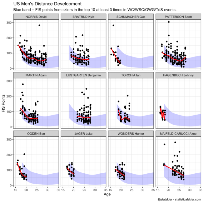
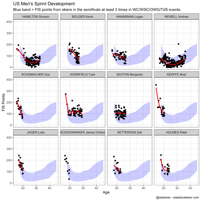
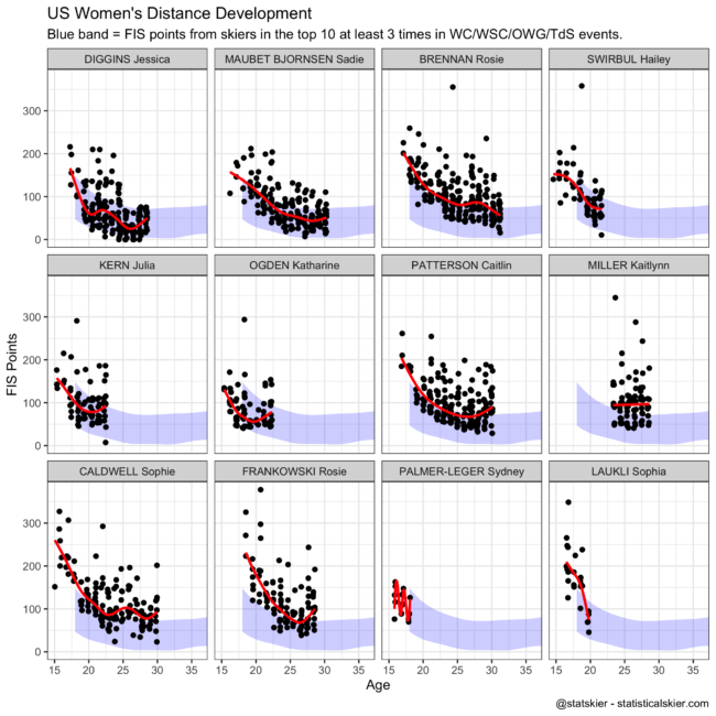
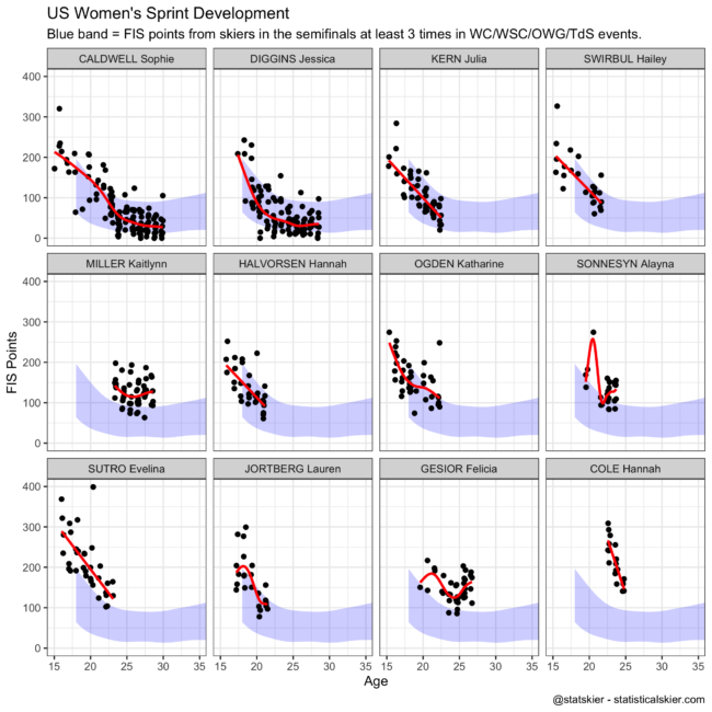
I posted these graphs on Twitter a few days ago with basically zero commentary, so I thought I should at least describe what I did in a tad more detail.
I make these graphs because they get at an aspect of something the US Ski Team leadership talks about fairly often: being “on track” for top international results. They are not meant to represent any actual artifact or analysis that the US Ski Team actually uses for making decisions. They are merely my translation of the general concept. There are lots of different ways you could actually approach this idea and end up with somewhat different conclusions.
First we need a definition of “top international results”. For distance events I took that to be finishing in the top ten in WC/WSC/OWG/TdS events at least three times. For sprints, reaching the semifinals in WC/WSC/OWG/TdS events at least three times.
Then I took those “successful” skiers and plotted a band that represents the 10th-90th percentile of their race FIS points by age. So this band represents what the bulk of these skier’s race FIS points looked like at different ages.
Then I plotted on top the actual race FIS points from some of the top US skiers according to the most recent FIS points ranking lists for distance and sprint. I skipped a few people who I believe retired, and generally tried to focus on younger skiers in places. But mostly I was just running down that ranking list.
Finally, the red trend line is tracking the median result for each skier. I was a tad lazy and didn’t tweak the smoother too rigorously for each skier, which results in some poor (overfit) results in a handful of cases. Those are the red lines that are really, really squiggly. If I were taking this more seriously, I’d replace those with a more rigid linear fit, or maybe just omit the trend line for those skiers entirely.