In one of the articles I wrote for FasterSkier.com, someone asked a question in the comments that I thought was interesting, so I dashed off a quick answer. Â Sadly, as is common when I do something quickly, I made a mistake. Â So I need to correct the record.
Commenter triguy mentioned that it would be interesting to look at the number of different skiers who land on the podium during each season. Â I hacked out something really quick in SQL and slapped it up in a comment. Â I had meant to return to that idea and look at turnover among top 10 finishers, top 30, etc.
When I did, I discovered a small error in the numbers I posted in that comment. Â The general trend is roughly the same, but the ratios should all be shifted slightly. Â So, my bad. Â But now I get to elaborate on that idea with actual graphs!The idea here is that the number of different skiers landing on the podium over the course of a season might give us some measure of how competitive the international ski racing scene is from year to year. Â So let’s say that we have a season with 10 races. Â That gives us 30 podium spots to allocate among our skiers. Â If the same three skiers always land in the top three (possibly in different orders) we’d have a churn value of 3/30, or not much churn.
If no single skier placed in the top three more than once, we’d get a churn value of 30/30, or a ton of churn (the most we could possible get, actually).
I actually made two small errors in calculating these the first time around. Â The first error was just a minor programming bug that inflated the values slightly. Â The second was that I neglected to account for a small remaining effect that stems from changes in the number of races that take place each season.
If you notice, the minimum amount of churn we can get for podium finishes, with 10 races, is 3/30. Â But that minimum gets smaller as the number of races goes up. Â So the possible range of churn values is actually changing with the number of races. Â This means that simply dividing the number of unique skiers with top 3 finishes by 30 isn’t enough. Â We need to scale each value relative to the possible range of churn for that number of races.
In the example I used above, suppose that 10 different skiers finished in the top three during our season, Â Then we’d have to calculate our churn as (10/30 – 3/30) / (1- 3/30). Â So that’s:
(Observed Churn – Minimum Churn) / (Range of possible churn values)
Complicated enough yet?
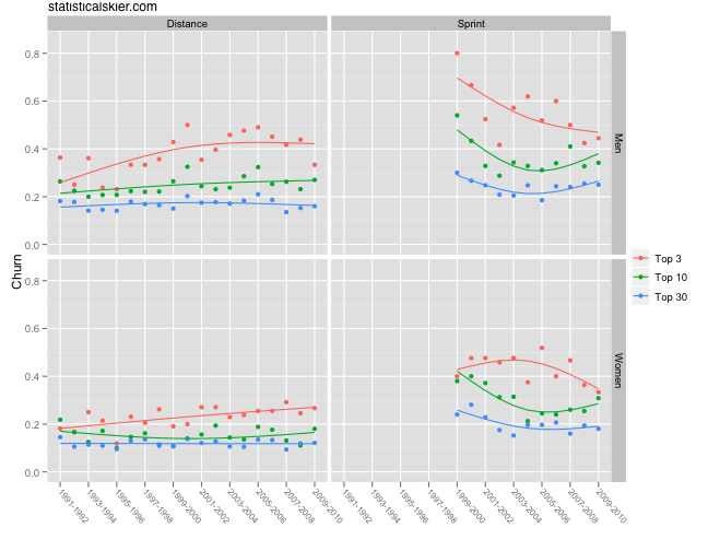
Here’s a graph of the churn values of the top 3, top 10 and top 30 for men’s and women’s distance races over the past 19 seasons:
There’s a small, but steady, increase in churn among the top three, for both men’s and women’s distance races. Â The men’s distance events had an extremely unusual year this past season. Â I’m betting it will bump back up again somewhat next year, but we’ll see. Â We happen to have three fairly dominant distance skiers at the moment in Petter Northug, Dario Cologna and Marcus Hellner.
Churn among top ten finishers for men’s distance races have maybe inched up slightly as well, but the rest have been essentially flat. Â This would suggest that the international racing scene is just as, or perhaps slightly more competitive now than at any point in the past 19 years.
The sprinting panels are pretty interesting. Â The dramatic differences between them and the distance events probably has to do with the newness of sprinting. Â As sprinting has gained in popularity and more athletes and nations are focusing on it, it will be harder for a small number of people to dominate these races. Â The graph suggests that the churn for sprinting might be converging towards the equivalent levels for distance racing, although time will tell on that one.
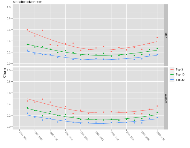
Now for a bit of surprise, here’s an graph showing the churn for men’s and women’s biathlon:
Biathlon has a “sprint” race but it’s not at all the same thing as sprinting in cross-country, so I consider everything they do on the international scene to be in a distance event. Â I’m including this due to the rather obvious differences, which I thought might be interesting. Â Churn in biathlon decreased for much of the 1990’s and then has slowly been ticking up again over the last decade.
I don’t know enough about international biathlon racing to comment intelligently on why we’d see a pattern like this, but I thought it noteworthy.
[ad#AdSenseBanner]


{ 1 } Trackback
[…] actually posted something related to this a while back that was more geared towards the question of competitiveness. Â I did some fancy math and concocted something to measure this idea that I called […]
Post a Comment