Skip to content

Statistical Skier: 1, SVG: 0

Take that vector graphics animation! For an explanation, see my previous effort.

Reminder: This should work in Chrome, Firefox and Safari. But consider it experimental. Reloading the page should restart the animation. I confirmed that this won’t work in Firefox, and that the one SVG plugin for Firefox has been discontinued by Adobe (although apparently it relied on ActiveX, so maybe that’s a good thing). So Chrome, Safari and probably Opera are your only options.

Actually, this is a hack. The translational arithmetic that was being used by the code I grabbed was, well, opaque. Once I got it to push the actual names of the teams around, it became clear that all the translations were off by some mysterious, unknown scaling factor. Trial and error solved that problem pretty quick, but the solution is just based on eyeballing the graph, so this is certainly not exact.

I wonder what sort of skiing data I can animate…

Tagged , ,

Stand Back! This Graph Is Alive!

This was just too cool for me not to put up on the site, even though I’m not completely happy with it. The data are fairly simple: add up the sprint and mountain points across all riders on a Tour de France team for each stage. So for each stage, each team gets the ordered pair (mountain points, sprint points) where the points are cumulative.

The cool part is that I’ve managed to get it animated, so you can watch the team’s progress through the Tour. The bad news is that the animation tools I’m using are apparently limited to pushing dots around a graph. Otherwise I’d actually plot the team names and animate them. As it is, you’ll have to wait for the animation to end and then mouse over the dots to get the team name. (Unless you have stupendous hand-eye coordination and can hold your cursor in the same spot on a dot for several seconds while it glides around.)

Another hiccup is that you’ll notice sometimes the dots move down or left, which would indicate that a team lost points that stage. Actually what’s happening is that team lost a rider, who either quit or was disqualified. I’m going to treat those as “lost” points unless some cycling expert instructs me otherwise.

This should work in Chrome, Firefox and Safari. But consider it experimental. Reloading the page should restart the animation. Ok, I confirmed that this won’t work in Firefox, and that the one SVG plugin for Firefox has been discontinued by Adobe (although apparently it relied on ActiveX, so maybe that’s a good thing). So Chrome, Safari and probably Opera are your only options.

The truly glorious part (to me) is how little code this required. There’s a little bit of work shuffling the data into the right format, but once that’s done this is all I needed to do in R:

doc <- svgPlot(plot(sprint~mountain,D1,xlab="Mountain",ylab="Sprint",xlim=c(0,300),ylim=c(0,350),pch=20))
addToolTips(doc,levels(pts_merge$team),addArea=2)
animate(doc,data=D,which=D$stage2,dropFirst = TRUE,begin=0,interval=3,labels = levels(pts_merge$stage))
saveXML(doc,"tdf_animation1.svg")

Sweet!

Tagged , , , ,

Tour de France Team-Nationality Guide

If you’re like me, you follow bike racing enough to grasp the basics and be familiar with most of the big names.  I’ll typically follow the TdF fairly closely, but other than that my cycling news consumption pretty much consists of whatever cool stuff Cosmo happens to write about.

That means that when the TdF does roll around, I’m embarrassed to admit that I have a hard time keeping the different teams straight.  They all have funny names built around foreign companies and people will often just abbreviate them.  And of course every few years, the sponsors change and so do the names.  Keeping track of which riders are on which teams is a bit much for me, but a more manageable goal is to have a rough sense of what countries the riders are from on each team.

Like everything else I do around here, that calls for a graph:

Yeah, Euskaltel-Euskadi being Basque only I can remember.  But there are always a bunch of “French” teams that just sort of blend together in my head: AG2R, FdJeux, Cofidis and Bbox Bouygues Telecom (Seriously? Bbox?).

Ok.  Lampre is primarily Italian, Milram is mostly German and Footon-Servetto is mostly Spanish.  Astana and Caisse d’Epargne are also mainly Spanish, but less than Footon-Servetto and Euskaltel-Euskadi.

Quick Step, Rabobank and Katusha are Belgian, Dutch and Russian.  From here immigration policies apparently get considerably looser.  Saxobank (not to be confused with Rabobank, dammit!) has a plurality of Danes.

Liquigas and Omega-Pharma-Lotto could be considered Italian and Belgian, but their immigrant populations are quite high: nearly half the team.

Then we have the open borders club.  The remaining teams have a plurality of riders from nations like GBr, USA and Aus, but are generally quite diverse.

Is this all a bit silly?  Maybe.  But it helps me keep the teams straight in my head, at least a little.

Tagged ,

A New Sprint Points Method

I’ve fussed in the past about the weaknesses of FIS points in distance events, but they really are quite useful.  Sprint events, however, just don’t have an equivalently simple and useful numerical summary.  I’ve resorted to using the final finishing rank (i.e. what place you came in, after the elimination rounds), but I’ve never been particularly happy about it.

Currently, FIS awards traditional FIS points for the qualification times only.  After that, all that matters is what place you come in.  This means that I end up tracking three different values for each sprint result: FIS points, qualification rank and final rank.  None of these are particularly easy to combine in a sensible way.

For bird’s eye level analyses, just using the final rank is generally sufficient.  But when you start drilling down to the level of individual athletes, or small groups of athletes, it doesn’t work very well.

As an example, consider my posts looking at season to season improvements by individual skiers in distance events.  You’ll notice I haven’t given sprint racing the same treatment.  Modifying my script to do roughly the same analysis using finishing place in sprint races was easy, but the results didn’t make much sense. Continue reading ›

Tagged , , ,

Tour de France Bumps Chart: Stage 14

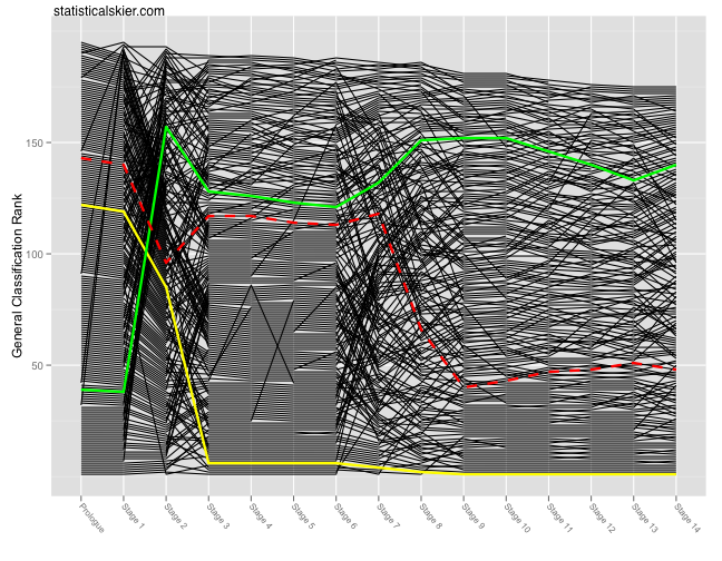
So I decided that updating these every day would get tedious.  Here’s the standard bumps chart after stage 14 and the corresponding average speed bumps chart is below the fold:

Continue reading ›

Tagged , ,

Week In Review: Friday July 16th

Now that I’m back from travelling for a bit (but only for a bit) things were a little more busy this week at Statistical Skier.

  • I debuted an interesting way to mine skiing results data to search for skiers with similar careers and used it to look at “similar” skiers to Beckie Scott.
  • I reproduced (with a few minor flourishes of my own) a version of some bumps charts for the Tour de France that I saw a few years back.
  • The list of World Cup skiers hanging up their boots this year continued, with Swiss skier Reto Burgermeister getting the career retrospective treatment.
  • A commenter asked for a version of my Tour de France bumps plot with the teams indicated in color (despite the fact that he is apparently colorblind) and I happily obliged, but suggested that a better way to look at that type of information is to use faceting.
  • Finally, with another Tour stage in the books, I updated the bumps plot to include the latest data.  Also, I added a bonus bumps chart showing the changes in average speed for each racer.

Obviously, things have strayed a bit from skiing to bike racing this week.  What can I say?  It’s summer, the Tour de France is in full swing and you just can’t turn down good data.  The cycling content will be pretty heavy until the Tour ends, just to warn you…

[ad#AdSenseBanner]

Tagged

Reader Request: Tour de France GC By Team

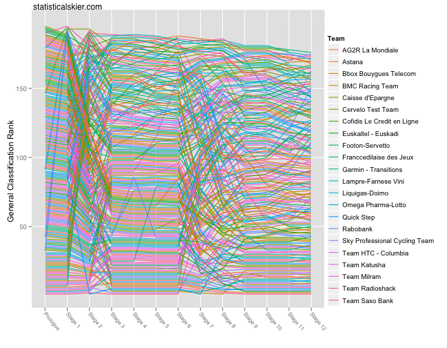
Commenter ryank asks if I can color code the lines for each rider according to their team.  I can, but it doesn’t lead to a great looking plot.  The reason is that there are just way too many teams and distinguishing that many colors just isn’t pleasant.

But I’m nothing if not responsive to my reader(s), so here it is:

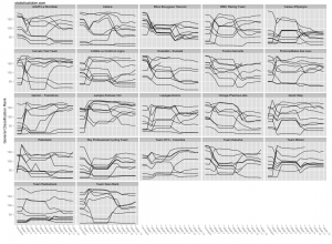
Like I said, not so hot.  There are 22 teams, which is way too many to distinguish by color.  A better option is faceting (or trellising):

Click through the image for a larger version.  I’ll leave it to the more educated cycling commentariat to interpret this plot, since there’s a lot going on in this one.

[ad#AdSenseBanner]

Tagged , ,